How to optimize your color chart for responsible branding?
Auteur(s) de l'article


How can you optimize the choice and use of your brand colors to contribute to responsible branding?
Color has no language. It touches us all instantly with a wide range of feelings, emotions, and messages.
As an essential part of your visual identity, colors help shape the perceived design of your brand. They have an impact on:
- brand awareness: Using the right color can increase your brand recognition by 80%
- the perception of your brand: Consumers make judgements about products in 90 seconds. And between 60 and 90% of these judgements are based on color alone.
- conversion: When shopping, 90% of customers focus on the brand's colors.
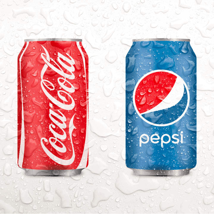
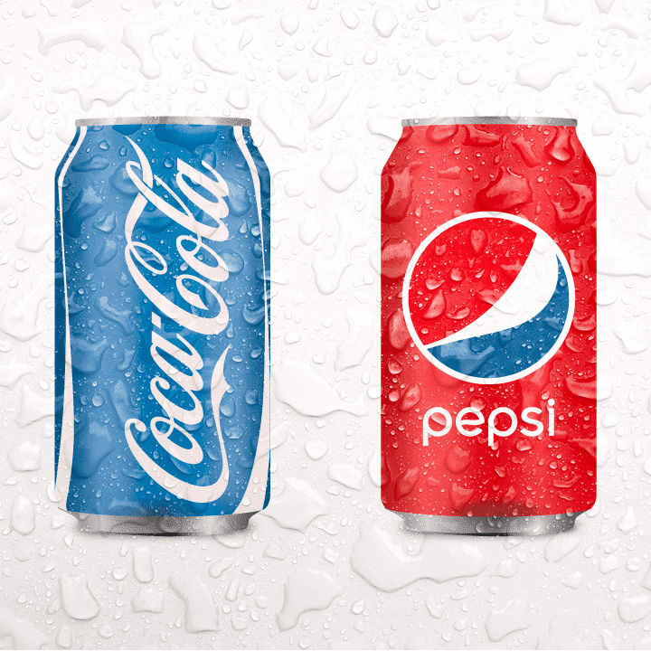
The proof is in the pudding with the most chosen brand in the world over the last 10 years(Kantar Brand Footprint 2022 study). In the image on the left, you recognize Coca-Cola in less than a tenth of a second. The image on the right is probably a bit confusing.
At agence Groom, we rely on the strategic work carried out upstream (analysis of your target and its culture, competition, choice of relevant communication channels, etc.) and on the symbolism of colors to create your color chart.
This makes it distinctive, relevant to your target audience, and thoughtful in its context of use.
What are the best practices to follow in order to make your color chart part of a responsible branding approach?
Your color chart should be consistent across all your communication channels
To develop the most suitable color chart, and use it correctly, determine whether your communication will be solely digital (social networks, website, etc.) or digital and printed (brochures, website, etc.).
Also, don't forget that color rendering is different from one screen to another, and also from a screen to a printed medium! So don't hesitate to do some color tests to check the rendering. If your printer only sends you a digital proof, it will be useless to appreciate the color rendering in print.
Good practice is not quite the same in the digital world as in the physical world, but the use of your colors should be consistent across all your communication channels. A consistent presence promotes good brand recognition.
How to optimize your color chart for the digital world for responsible branding?
The screen display is one of the biggest energy consumers on a smartphone. The colors displayed can help to reduce this energy consumption.
1. Put yourself in the right conditions
Start by turning off the night mode or blue light filters on your computer to work on your color chart. Work in natural light to reflect the colors as accurately as possible. Avoid overexposure and backlighting.
2. Choose the RGB color mode
In the digital world, the color mode is RGB for Red, Green, Blue. Each pixel of our screens (smartphones, tablets...) is composed of three sub-pixels. These three sub-pixels are illuminated in a more or less intense way in red, green and blue. The human eye cannot distinguish these sub-pixels because they are too small. It perceives the superposition of the lights they emit. For example, a pixel is yellow because its red and green sub-pixels light up. And a pixel is white when the 3 sub-pixels (red, green and blue) light up to the maximum.
It is also possible to use the hex values of the colors which are a concatenation of the RGB parameters.
3. Go for black
A black pixel consumes up to 60% less energy than a white pixel (source : le monde de l’énergie).
Displays use technologies that work in different ways. With OLED (Organic Light-Emitting Diodes) or AMOLED (Active-Matrix Organic Light-Emitting Diode) technology, found in iPhones for example, each pixel is independently illuminated by a LED. The pixels that are supposed to display black are simply switched off. Black therefore does not consume any electricity.
This is not the case with LCD (Liquid Crystal Display) screens, in the Samsung Galaxy A12 for example, where a backlight always remains on regardless of the screen color. With LCD technology, a synthesis of blue, green and red sub-pixels is used to create black by simulation.
Today, LCD technology dominates the smartphone market - with the exception of 5G smartphones, which are 80% dominated by OLED panels. However, by January 2022, global sales of 5G smartphones exceeded those of 4G smartphones (source: Counterpoint Research). In 2022, 44% of the smartphone market will use OLED technology, compared to 32% in 2020 (source: Counterpoint Research's Smartphone Sales Forecast by Display Type)). The long term perspective is the trend for OLEDs to take the place of LCDs in smartphones, connected watches, tablets and laptops (sources: l'usine nouvelle and Counterpoint Research).
The strategic work done beforehand allows you to better understand your target and their habits: will they connect to your brand via their 5G smartphone? If so, black makes sense.
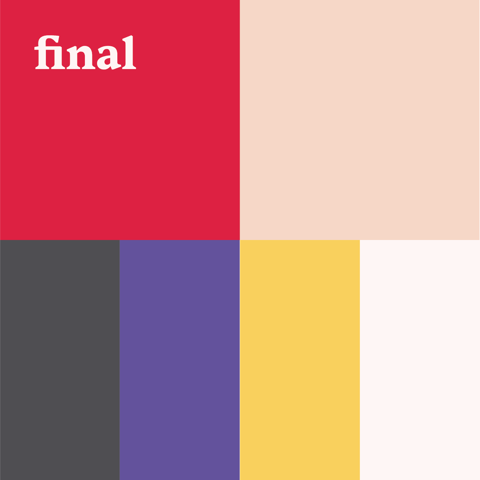
Avoid using pure black and pure white together.
For a more natural look and easier reading, choose an off-white with pure black (RGB code: 0,0,0) or a pure white (RGB code: 255,255,255) with dark grey (RGB code: 41,44,45, or 51,51,51 for example).
The image on the left below shows the combination of a pure white with a pure black. The image on the right shows the combination of an off-white with a dark grey, more pleasing to the eye.


5. Focus on red and green
A Google analysis (Android Dev Summit 2018) shows that white and blue are the most energy-intensive colors, consuming almost twice as much power as green or red.
Furthermore, the colors yellow, green and orange are in the middle of the visible spectrum (the range of colors that our eyes can perceive) and are the easiest colors to see (source: ça m’intéresse).
Another reason to choose green or red over blue or white is that the blue light emitted by a screen tires the eyes and can even prevent proper sleep after prolonged evening use. Also, blue light in the visible spectrum seems to accelerate age-related macular degeneration (AMD) more than other rays in the spectrum (source: American Macular Degeneration Foundation). And, exposure to blue light in teenagers and people in their 20s and 30s can advance the risk of developing AMD by 10 years and double the risk of suffering blindness over a lifetime (source: Beaver Dam Eye Study). However, the duration of use probably has a much greater impact on eye fatigue and health than the mode or light intensity of the device (source: Euna Koo, CNN business).
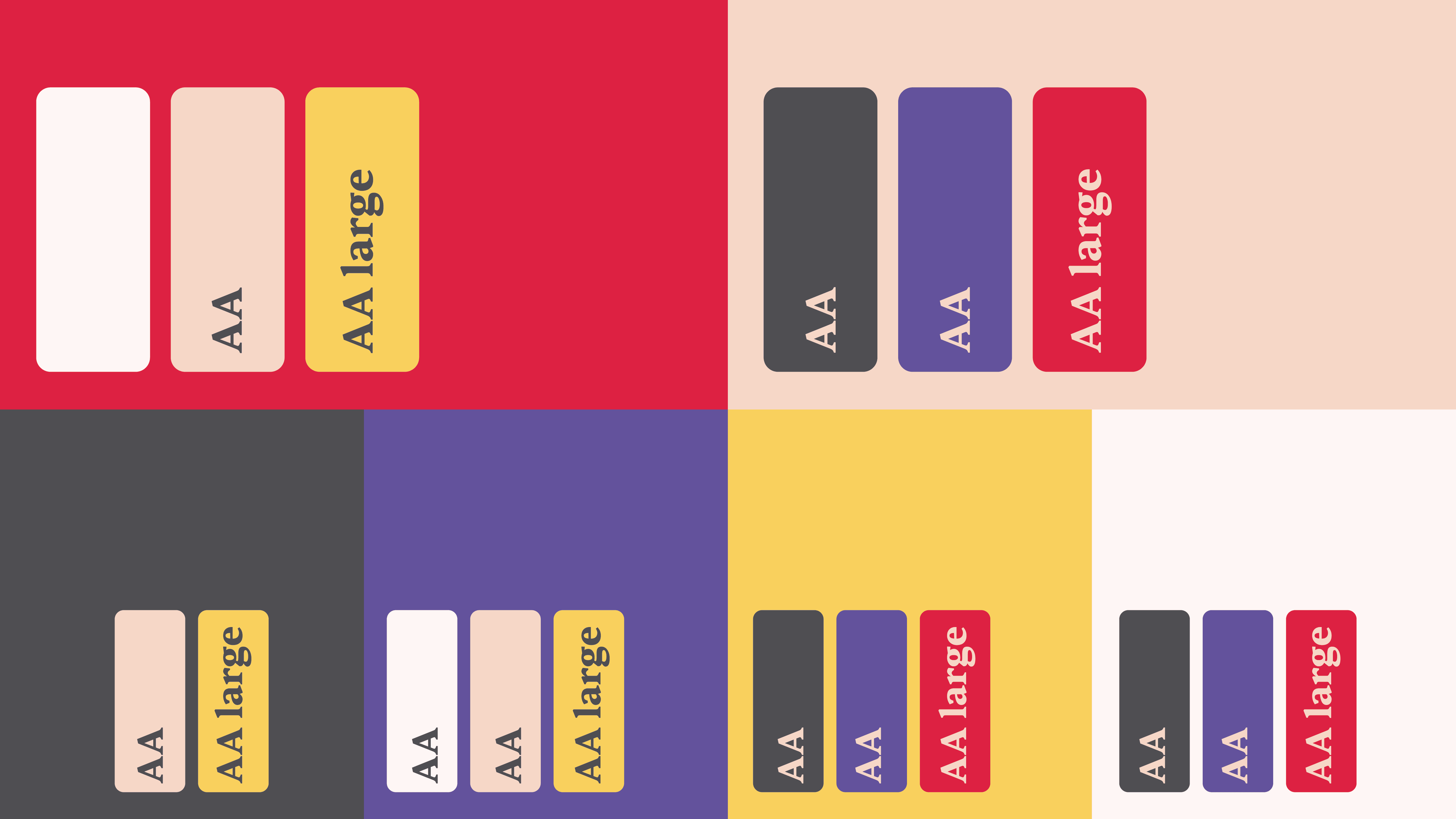
6. Check the accessibility of the colors in your color chart to each other
Not only must the colors in your color chart match each other, but they must also offer sufficient contrast to allow your messages to be read.
We do not all distinguish colors in the same way. Some of us are color blind, visually impaired, or find ourselves in different environments or situations that make the perception of colors and contrasts complex.
The accessibility of your color chart must be adapted to its context of use..
There are three levels of accessibility: A (the lowest), AA and AAA (the highest). Depending on the country of use, your target audience, and the type of website (private or public, e-commerce...) you have, the level of requirement varies. In Europe, if your site is e-commerce, the minimum is AA. You have until June 28, 2025 to comply with the WCAG 2.1 level AA recommendations:
- to meet an AA level of accessibility: text and its background must have a contrast ratio of at least 4.5:1 and 14pt bold or 18pt text must have a ratio of 3:1. User interface components and graphic objects have a contrast ratio of at least 3:1.
- to meet AAA accessibility levels: text and background should have a contrast ratio of at least 7:1 and 14pt bold or 18pt text a ratio of 4.5:1.
How can you check the accessibility of your color chart?
Start by testing each colour in your color chart against each other. In this way, you will establish an accessibility matrix for your colors. You will know which colours from your colour chart to use together and in which context (minimum text size on background colour).
If your color chart has more than 4 colors, and if a color is only accessible with one other color in your chart, change it so that it is accessible with more colors, or consider deleting it. Drawing up an accessibility matrix will allow you to simplify your color chart, which is often too complex.
A simpler color chart is more differentiating.
Try to develop a consistent accessibility matrix with a maximum of 6 colors (including white and black), with each color accessible with half the color chart.
Tools
You need to convert your RGB colors into hex codes, you can easily find a converter on the internet.
- https://colorable.jxnblk.com/ : you can test the color and its background and play with the hue, saturation and lightness
- https://color.review/
- https://app.contrast-finder.org/ : if the contrast is not sufficient, the tool proposes alternative colors offering a correct contrast
How to interpret the results?
You will test each color with all the others, the results can be:
- AAA: this is the maximum level of accessibility, you can use these colors together. The contrast ratio is at least 7:1.
- AA: the AA accessibility standard is achieved for all text (regardless of size and weight). The contrast ratio is 4.5:1 minimum. This means you can use the colors together without restriction.
- AA large: accessibility is only achieved if the foreground text is 18pt (24 px) or 14pt (19 px) if it is bold.
- fail: accessibility is not achieved. Do not use these two colours together!
Communicate the accessibility matrix internally, and make sure that it is understood and respected by all the people who will produce your communication materials!
7. Test the results in dark mode (or night option)
Dark mode even at maximum brightness saves power, and therefore battery life, on a smartphone with an OLED or AMOLED screen. Using YouTube's dark mode can save between 15% and 60% of battery life, depending on the brightness of the screen. (source: google)
The dark mode emits less blue light, which would be less tiring. It seems more pleasant and aesthetically pleasing to some users.
However, studies show that black text on white is more readable, dark objects on a light background are easier to distinguish.
In a bright environment, the light mode might be easier for your reading and even make you more productive.
The dark mode is very popular: Gmail, Instagram, YouTube, Google Calendar, Twitter, Word... now offer this service. If it is relevant to develop a dark mode for your website, your color chart must remain accessible.
8. Build on the strategic work done upstream
What do you know about your target audience, their consumption habits?
Your color chart must be thought out in its real context of use. If your audience mainly connects to you via an iPhone in the evening, go for black.
Can your target group use mostly blue light filters? If so, consider that using blue will not result in good brand recognition. The filter will degrade this color.
How to optimize your color chart in your printed communication for responsible branding?
1. Choose eco-colors.
The color mode for printing is CMYK for Cyan, Magenta, Yellow and Black. Media are printed by superimposing these 4 inks. Unlike RGB mode, which sends one or more lights to reconstitute a color, it is the light absorbed by the inks that reconstitutes the color in CMYK mode. For example, by superimposing magenta ink with yellow ink, we obtain red. Overlaying cyan, magenta, and yellow inks produces dark brown, to which black ink must be added to obtain "true" black.
The CMYK color palette is smaller than the RGB palette, which results in a difference in hues when converting from RGB to CMYK color mode. The print will be darker in CMYK than in RGB, which uses light to produce vivid colors. Glossy, metallic, or fluorescent effects cannot be printed in CMYK, in which case different inks must be used.
In CMYK mode, a color is defined by the percentage of cyan, magenta, yellow and black it contains. By adding these percentages together, we obtain a value called the ink coverage.
The higher the ink coverage, the more ink is consumed.
Too much ink can lead to quality defects and poor visual appearance. A paper with too much ink is excessively humid, takes longer to dry and is more likely to become dirty or degraded. The European colorimetric standard recommends not exceeding an inking rate of 300%. Depending on the nature of the paper, printers may even recommend a maximum ink coverage of 270% or even 220%. Ask your printer for the maximum ink coverage for the material you wish to use.
An eco-color has an ink coverage of 100% or less.
Try to reduce the ink coverages of each of the colors in your color chart as much as possible, which ideally should be composed of eco-colors only.
However, be careful not to lose the information conveyed by the color (see case study 2 in this article). If replacing a color with an eco-color leads to a loss of accessibility or information, it is better to reduce the ink coverage of this color as much as possible and choose to use it only sparingly. For example, you could set a target of not using this non-eco-color on more than 5% of your printed material.
2. The quantity must be reasoned (and reasonable).
« LESS IS MORE »
Apply the principle of "less is more" when choosing the printed medium and designing it.
- Think about the need that your support addresses.
What information does color provide in this context of use? Is it really necessary?
For example, you can design your invoices and quotes in black and white.
This article focuses on optimising the color chart for responsible branding. Of course, it is essential to consider the entire life cycle of the printed material and to question its relevance, its durability, its supplier, and the quantity needed.
- Using a large amount of eco-color makes no sense. When designing the printed material, try to limit the amount of ink that will be needed. For example:
- Prefer the use of natural backgrounds of the printed material: the natural white of the paper can avoid using a large amount of an eco-color.
- You could outline some of the words written in large letters, such as your logo.
In the digital or print world, use your colors wisely
- Use the best contrasts. Text is more legible when printed in black and white.
- Respect the results of your accessibility matrix. For example, if your color chart is red and pink and the result of the red on pink accessibility test is AA large, the red text should be at least 14pt if bold or 18pt if not, on the pink background. However, if the text is part of your logo or brand name, there is no contrast requirement under WCAG 2.1. Similarly, if a text or text image is purely decorative, there is no contrast requirement.
- Avoid giving or highlighting information with color alone. For example, if you use red to indicate that a form field is incorrectly filled in, also add a warning (or other) symbol.
Case study 1
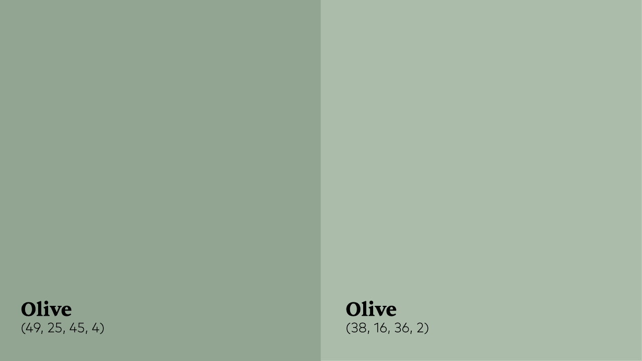
The original olive color has the CMYK code (49, 25, 45, 4): it is therefore composed of 49% cyan, 25% magenta, 45% yellow and 4% black. The ink coverage is 123%. By reducing the ink dosages, this olive color can be replaced by an eco-color, with an ink coverage of 92% (CMYK code: 36, 16, 38, 2). This eco-color will have the same accessibility results with pure black as the initial color. It will even offer better accessibility on bluish grey.
Case study 2
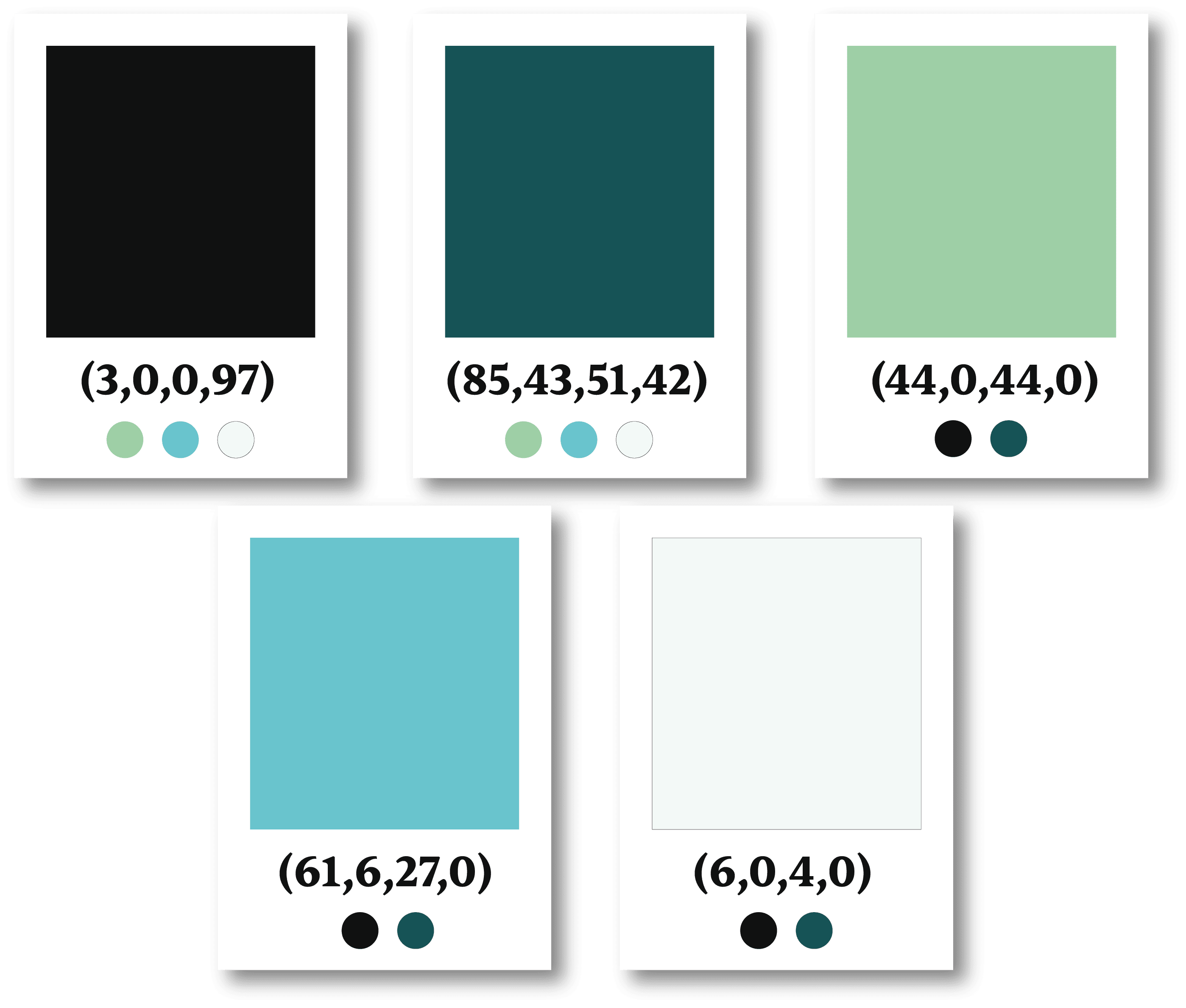
The initial color chart is composed of 7 colors, including 2 eco-colors. By trying to convert all the colors into eco-colors, the color chart becomes bland: we lose the information provided by the violet and red, as well as the accessibility of these colors with the rest of the chart. We therefore propose to keep the eco-colors, except for violet and red for which we reduce the ink coverage as much as possible without lowering it to 100%. For greater accessibility, the peach color had to be lightened, we propose to simplify this color chart by keeping a single peach color, of which the original pale pink is a tint. And, to better integrate the color chart, the original pure white is replaced by a very slightly pinkish white.
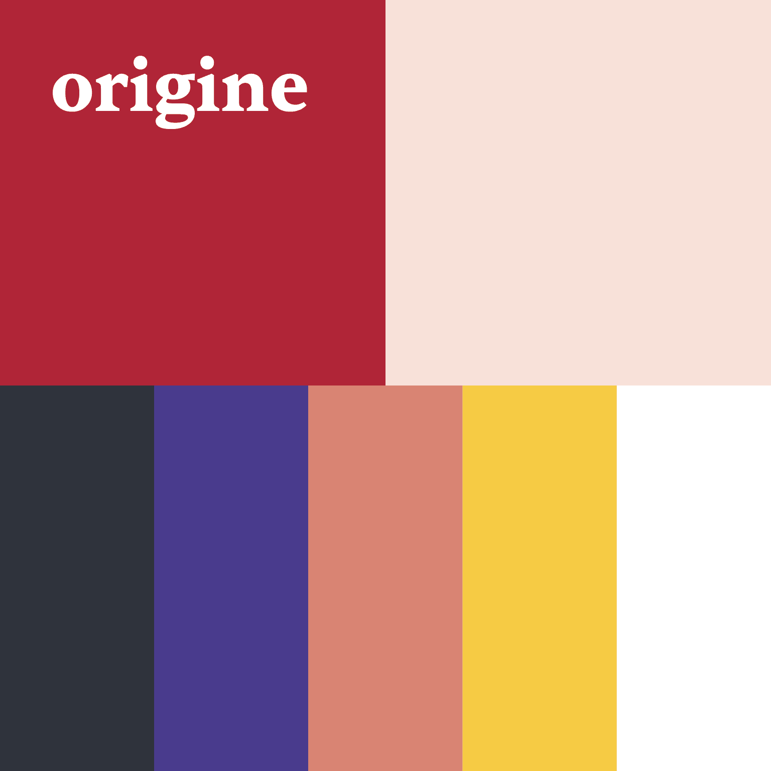

The final color chart is simplified, still accessible and more responsible. Accessibility tests make it easier to know how to use the colors together. This optimised color chart is part of a responsible branding approach.
For prints, red and purple should be sparingly used. The new white should not be used but should be replaced by natural paper.
Case study 3
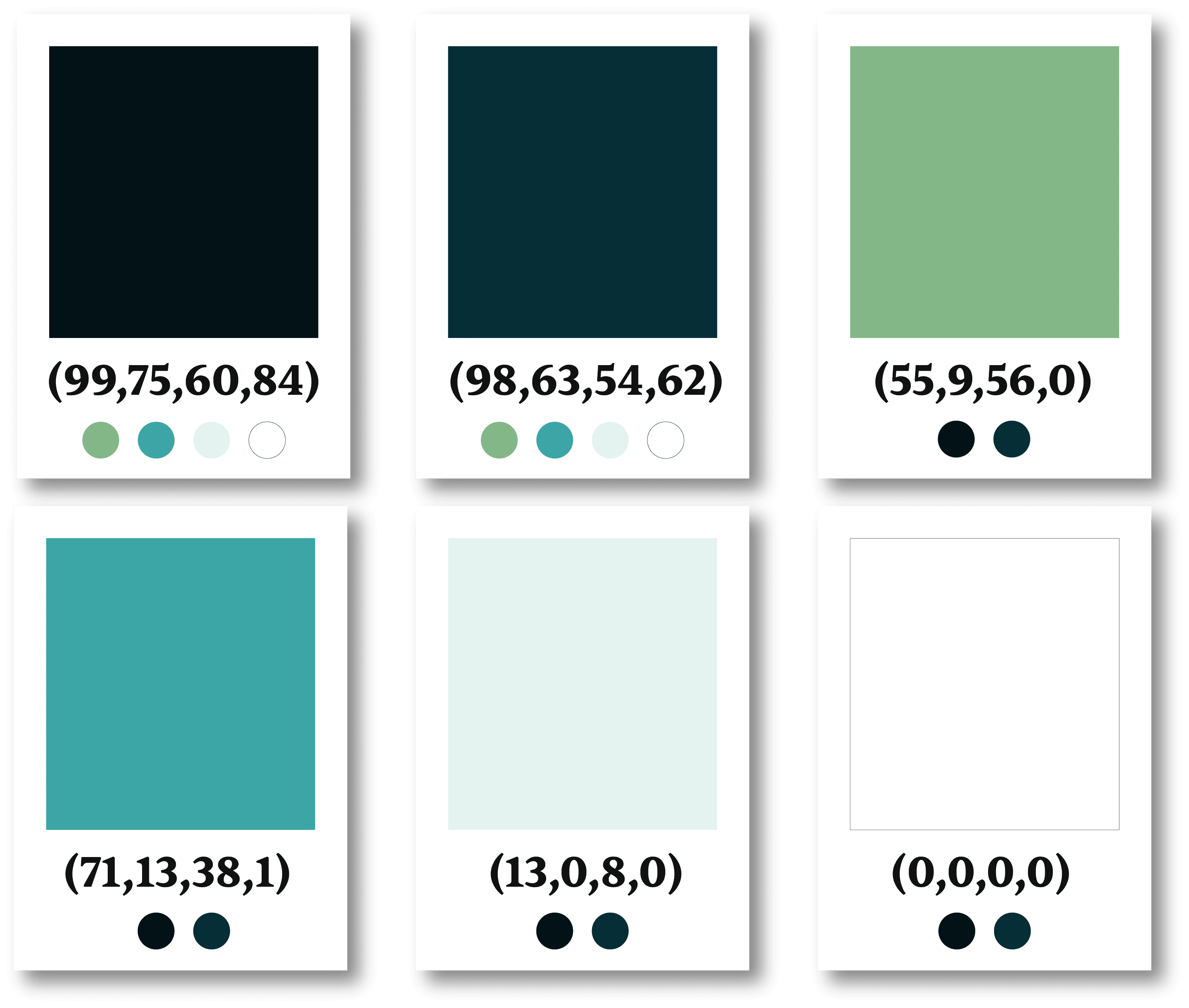
The initial color chart consists of 6 colors. The only two eco-colors in the initial color chart are pale water green and white. Black and emerald are too close: either one of these two colors should be removed, or the emerald should be lightened to distinguish them better. This choice should be based on the strategic work carried out upstream. Here, for a more complete work of the example, we keep the two colors. In the same way, the pale water green and the white are too close, only one intermediate color should be kept.
The revised color chart therefore features 4 eco-colors and an emerald color with a reduced ink coverage. In addition, black and emerald stand out better. The proposed colors are brighter, the color chart is more dynamic. This new colour chart is part of a responsible branding approach.
Summary of good practices for your color chart to contribute to responsible branding
- Use the same color chart in the digital and print world for good brand recognition.
- Try to keep your color chart as simple as possible.
- Rely on the strategic work carried out upstream so that your color chart better responds to your target's habits
- On your website, do not use pure white with pure black, use dark colors, green and red if possible.
- Draw up an accessibility matrix for your color chart
- Your graphic design should respect your accessibility matrix and limit the use of colors with a high ink coverage (above 100%).
- do not use colors that are not accessible together
- respect the minimum text sizes recommended to ensure sufficient contrast
- sparingly use colors with an ink coverage higher than 100%.
- Check the ink coverages of each color in your color chart. Reduce them as much as possible while keeping the information conveyed by the color and its accessibility. Ideally, the ink coverage of each color should be less than 100%. The game consists of juggling the information conveyed by the color, sufficient accessibility, and a low ink coverage.
- Communicate good practice internally. All those who will produce your communication materials must understand and respect them.
- Finally, for design, always opt for "less is more".
In conclusion, ensuring the accessibility of your color chart and using eco-colors contributes to responsible branding
By working on the accessibility of your color chart, you can simplify it and know how best to use your colors together. You will use less ink for each print by lowering the ink coverage.
Your color chart can therefore contribute to more responsible, more inclusive, and less polluting communication.
To further your responsible approach, find all our articles: https://agencegroom.com/en/blog/
Share
Updated on :